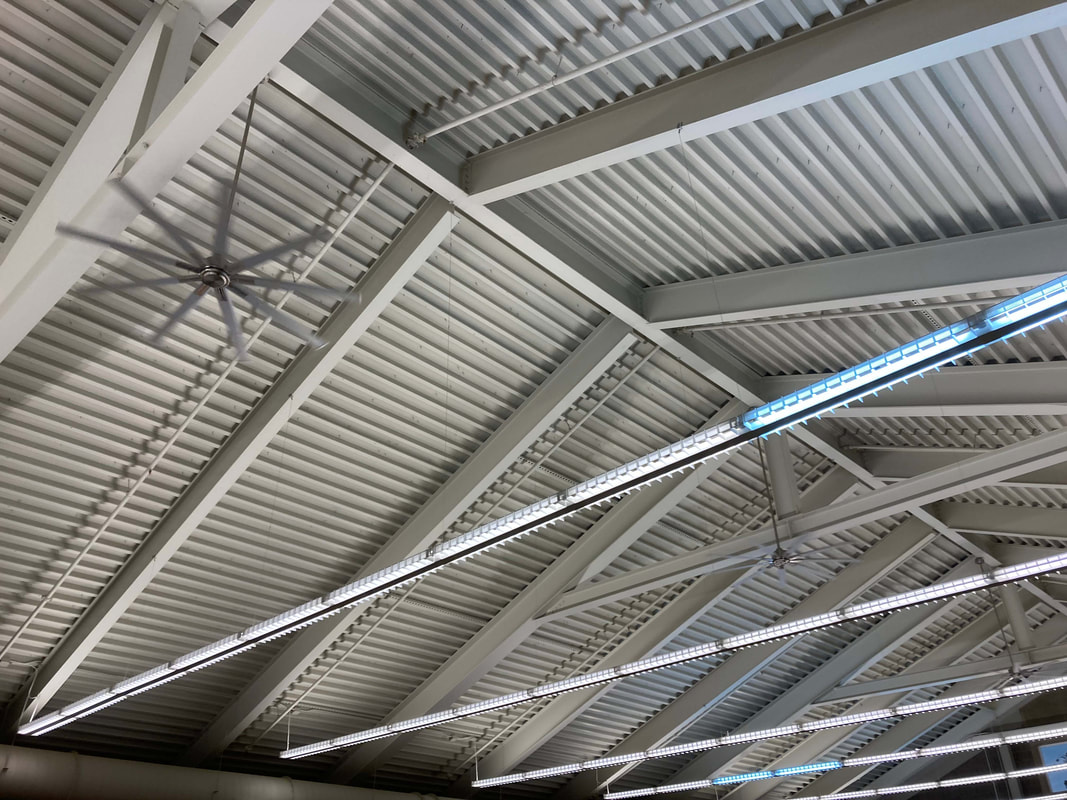
Lines of the Ceiling-Roof
|
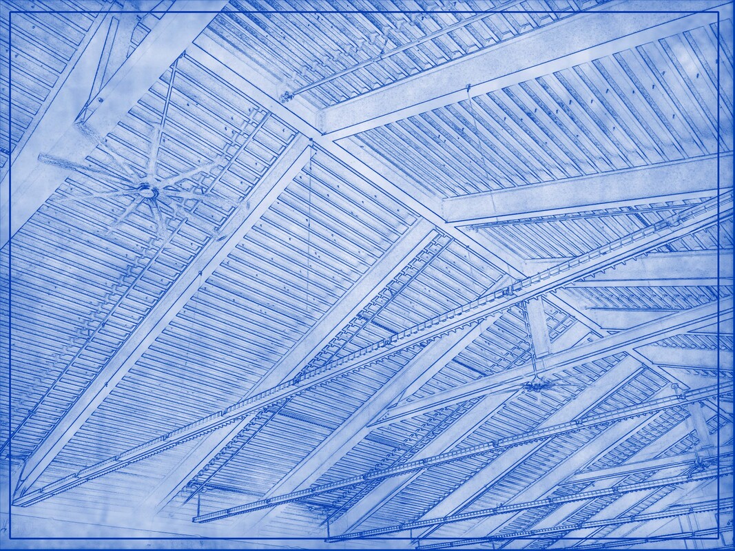
The Fan and the Roof
|
I was concerned about getting my photos, as I was going to an event over the weekend. I took some photos of the ceiling (because of the no-people rule), and they actually turned out pretty well. I think that the sharp lines make for a great blueprint- Find Edges seems to thrive with the sort of clear lines here.
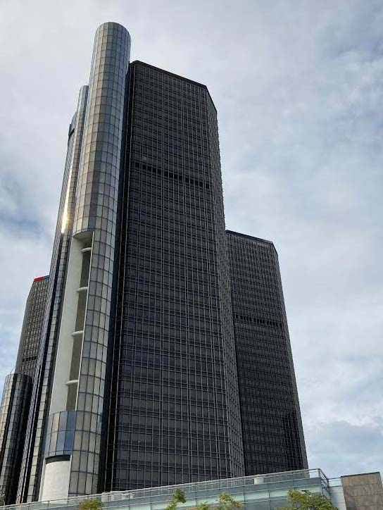
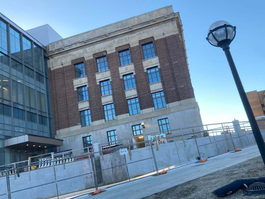
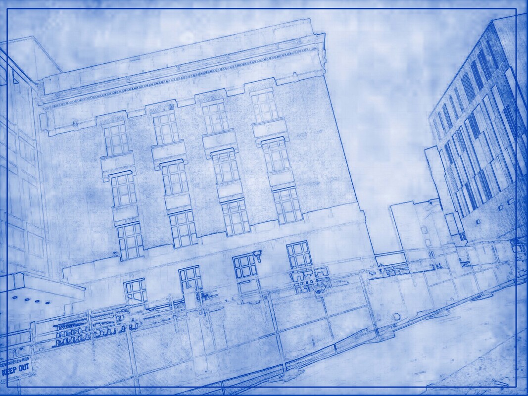
The Sterling City
|
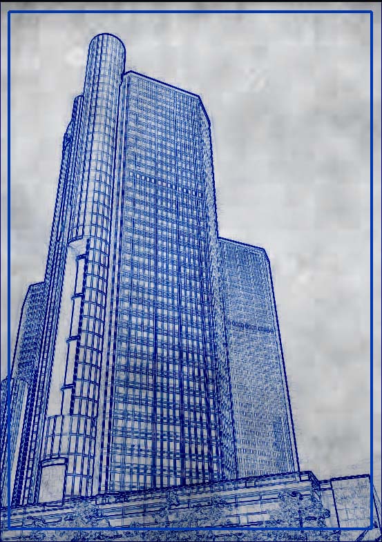
Blueprint for Building a Skyscraper
|
These are from a trip a tiny bit ago to Detroit. There's a skyscraper by the water that I got some photos of, and, as we're doing a Architecture unit, I thought that it looked good. The blueprint lines feel a but thick, but ah well- the shape is still clear and it still looks enough like a blueprint. The surrounding area is less blue than I was expecting, especially compared to other blueprints. I think it might be because I desaturated the parchment (making it grey), but it isn't being screened by the blue layer.
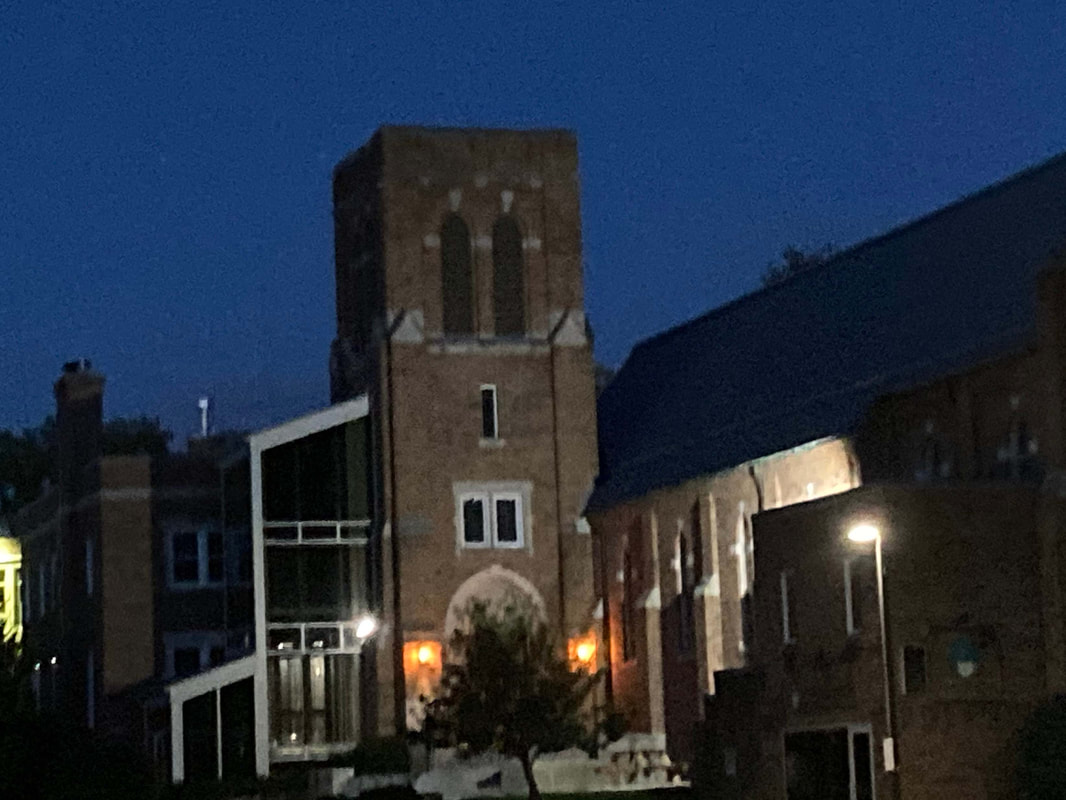
A Building at Night
|
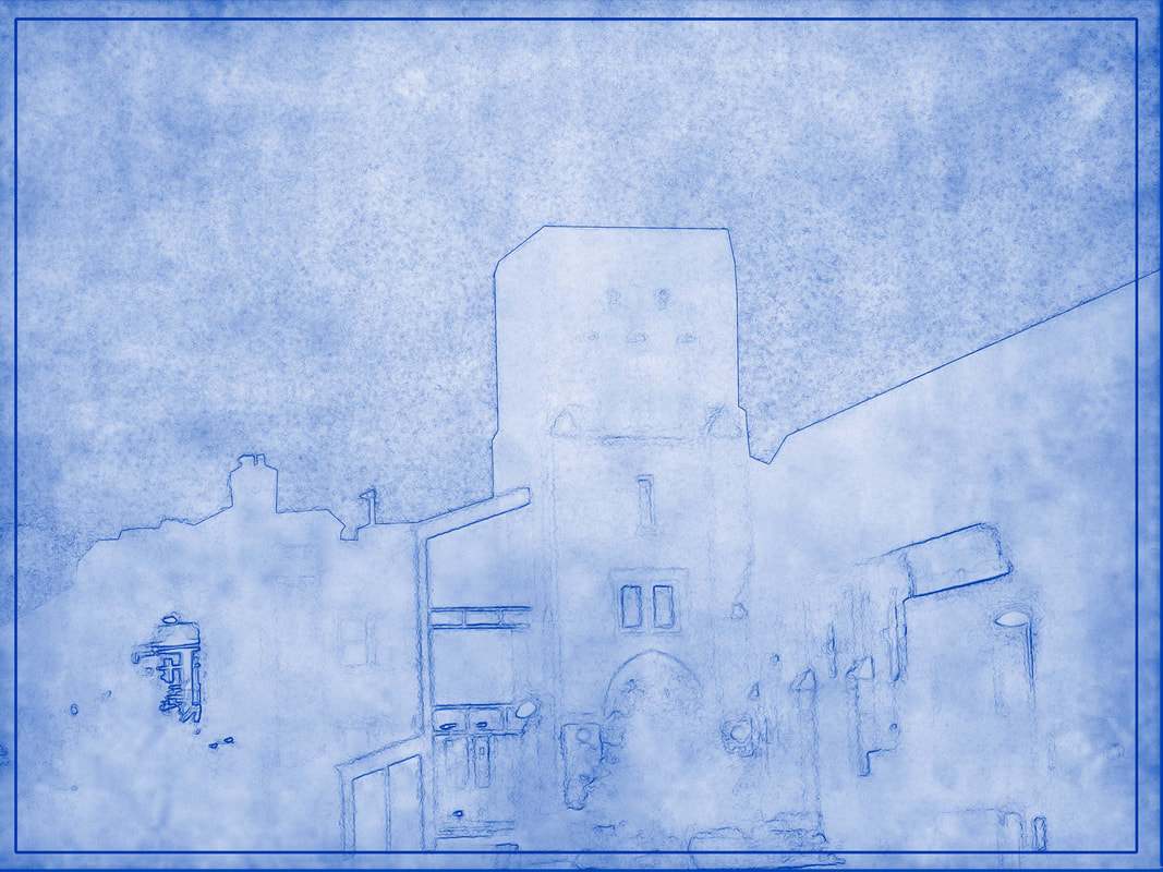
Rough Draft of a Building
|
Some of the lines here are a bit blurry- most of them, in fact. There's not as much clear delineation of lines here as there was in the others. I tried to dodge/burn some sections to increase the contrast, and that worked a bit, but much of it is still pretty unfilled.
The Square Building and the Circle Lamp
|
Perspective in Blue-Tint
|
As I was driving by, I saw this building and thought it would be a good target. It definitely creates a more realistic blueprint effect- the rectangular and blocky building has lines with enough definition for Find Edges. The angle is a bit interesting, too- wasn't intentional when I was taking them, but it does a bit of a Dutch Angle thing.
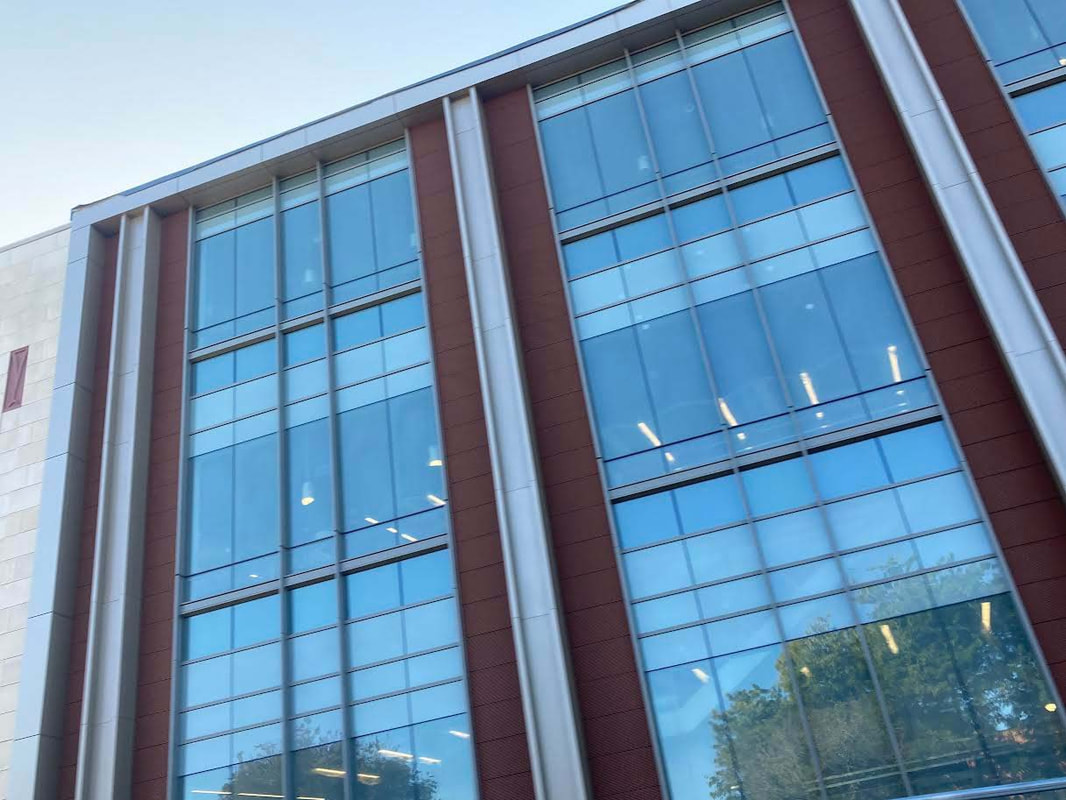
Drive-by of a Standard Building
|
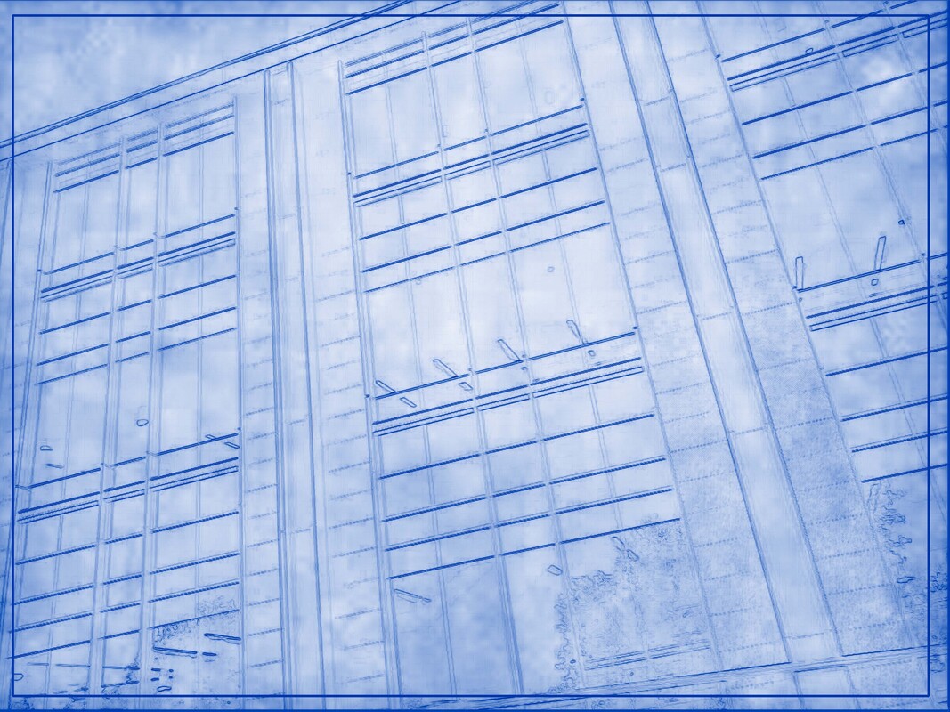
Perfectly Standard Building at a Twenty-Degree Angle
|
This isn't my favorite. The building is a bit bland, though the reflection of the tree does spice things up a bit. The lines are clear enough. The lights inside maps to moderately strange things in the Blueprint, but I guess that makes sense- it's not like Find Edges can delineate between light/not light and a building line.
